Read and visualize raster data
Last updated on 2026-04-09 | Edit this page
Estimated time: 100 minutes
Overview
Questions
- How is a raster represented by rioxarray?
- How do I read and plot raster data in Python?
- How can I handle missing data?
Objectives
- Describe the fundamental attributes of a raster dataset.
- Explore raster attributes and metadata using Python.
- Read rasters into Python using the
rioxarraypackage. - Visualize single/multi-band raster data.
Raster Data
In the first episode of this course we provided an introduction on what Raster datasets are and how these divert from vector data. In this episode we will dive more into raster data and focus on how to work with them. We introduce fundamental principles, python packages, metadata and raster attributes for working with this type of data. In addition, we will explore how Python handles missing and bad data values.
The Python package we will use throughout this episode to handle
raster data is rioxarray.
This package is based on the popular rasterio
(which is build upon the GDAL library) for working with raster data and
xarray
for working with multi-dimensional arrays.
rioxarray extends xarray by providing
top-level functions like the open_rasterio
function to open raster datasets. Furthermore, it adds a set of methods
to the main objects of the xarray package like the Dataset
and the DataArray.
These methods are made available via the rio accessor and
become available from xarray objects after importing
rioxarray.
Exploring rioxarray and getting
help
Since a lot of the functions, methods and attributes from
rioxarray originate from other packages (mostly
rasterio), the documentation is in some cases limited and
requires a little puzzling. It is therefore recommended to foremost
focus at the notebook´s functionality to use tab completion and go
through the various functionalities. In addition, adding a question mark
? after every function or method offers the opportunity to
see the available options.
For instance if you want to understand the options for rioxarray´s
open_rasterio function:
Introduce the data
In this episode, we will use satellite images from the search that we have carried out in the episode: “Access satellite imagery using Python”. Briefly, we have searched for Sentinel-2 scenes of Rhodes from July 1st to August 31st 2023 that have less than 1% cloud coverage. The search resulted in 11 scenes. We focus here on the most recent scene (August 27th), since that would show the situation after the wildfire, and use this as an example to demonstrate raster data loading and visualization.
For your convenience, we included the scene of interest among the
datasets that you have already downloaded when following the setup instructions (the raster data files
should be in the data/sentinel2 directory). You should,
however, be able to download the same datasets “on-the-fly” using the
JSON metadata file that was created in the
previous episode (the file rhodes_sentinel-2.json).
If you choose to work with the provided data (which is advised in case you are working offline or have a slow/unstable network connection) you can skip the remaining part of the block and continue with the following section: Load a Raster and View Attributes.
If you want instead to experiment with downloading the data
on-the-fly, you need to load the file
rhodes_sentinel-2.json, which contains information on where
and how to access the target images from the remote repository:
The loaded item collection is equivalent to the one returned by
pystac_client when querying the API in the the episode: “Access satellite imagery using
Python”. You can thus perform the same actions on it, like accessing
the individual items using their index. Here we select the first item in
the collection, which is the most recent:
OUTPUT
<Item id=S2A_35SNA_20230827_0_L2A>In this episode we will consider the red band and the true color
image associated with this scene. They are labelled with the
red and visual keys, respectively, in the
asset dictionary. For each asset, we extract the URL / href
(Hypertext Reference) that point to the file, and store it in a variable
that we can use later on to access the data instead of the raster data
paths:
Load a Raster and View Attributes
To analyse the burned areas, we are interested in the red band of the
satellite scene. In episode 9 we will
further explain why the characteristics of that band are interesting in
relation to wildfires. For now, we can load the red band using the
function rioxarray.open_rasterio():
The first call to rioxarray.open_rasterio() opens the
file and it returns a xarray.DataArray object. The object
is stored in a variable, i.e. rhodes_red. Reading in the
data with xarray instead of rioxarray also
returns a xarray.DataArray, but the output will not contain
the geospatial metadata (such as projection information). You can use
numpy functions or built-in Python math operators on a
xarray.DataArray just like a numpy array. Calling the
variable name of the DataArray also prints out all of its
metadata information.
By printing the variable we can get a quick look at the shape and attributes of the data.
OUTPUT
<xarray.DataArray (band: 1, y: 10980, x: 10980)> Size: 241MB
[120560400 values with dtype=uint16]
Coordinates:
  * band         (band) int32 4B 1
  * x            (x) float64 88kB 5e+05 5e+05 5e+05 ... 6.098e+05 6.098e+05
  * y            (y) float64 88kB 4.1e+06 4.1e+06 4.1e+06 ... 3.99e+06 3.99e+06
    spatial_ref  int32 4B 0
Attributes:
    AREA_OR_POINT:       Area
    OVR_RESAMPLING_ALG:  AVERAGE
    _FillValue:          0
    scale_factor:        1.0
    add_offset:          0.0
The output tells us that we are looking at an
xarray.DataArray, with 1 band,
10980 rows, and 10980 columns. We can also see
the number of pixel values in the DataArray, and the type
of those pixel values, which is unsigned integer (or
uint16). The DataArray also stores different
values for the coordinates of the DataArray. When using
rioxarray, the term coordinates refers to spatial
coordinates like x and y but also the
band coordinate. Each of these sequences of values has its
own data type, like float64 for the spatial coordinates and
int64 for the band coordinate.
This DataArray object also has a couple of attributes
that are accessed like .rio.crs, .rio.nodata,
and .rio.bounds() (in jupyter you can browse through these
attributes by using tab for auto completion or have a look
at the documentation here),
which contains the metadata for the file we opened. Note that many of
the metadata are accessed as attributes without (), however
since bounds() is a method (i.e. a function in an object)
it requires these parentheses this is also the case for
.rio.resolution().
PYTHON
print(rhodes_red.rio.crs)
print(rhodes_red.rio.nodata)
print(rhodes_red.rio.bounds())
print(rhodes_red.rio.width)
print(rhodes_red.rio.height)
print(rhodes_red.rio.resolution())
OUTPUT
EPSG:32635
0
(499980.0, 3990240.0, 609780.0, 4100040.0)
10980
10980
(10.0, -10.0)
The Coordinate Reference System, or rhodes_red.rio.crs,
is reported as the string EPSG:32635. The
nodata value is encoded as 0 and the bounding box corners
of our raster are represented by the output of .bounds() as
a tuple (like a list but you can’t edit it). The height and
width match what we saw when we printed the DataArray, but
by using .rio.width and .rio.height we can
access these values if we need them in calculations.
Visualize a Raster
After viewing the attributes of our raster, we can examine the raw
values of the array with .values:
OUTPUT
array([[[    0,     0,     0, ...,  8888,  9075,  8139],
        [    0,     0,     0, ..., 10444, 10358,  8669],
        [    0,     0,     0, ..., 10346, 10659,  9168],
        ...,
        [    0,     0,     0, ...,  4295,  4289,  4320],
        [    0,     0,     0, ...,  4291,  4269,  4179],
        [    0,     0,     0, ...,  3944,  3503,  3862]]], dtype=uint16)
This can give us a quick view of the values of our array, but only at
the corners. Since our raster is loaded in python as a
DataArray type, we can plot this in one line similar to a
pandas DataFrame with DataArray.plot().
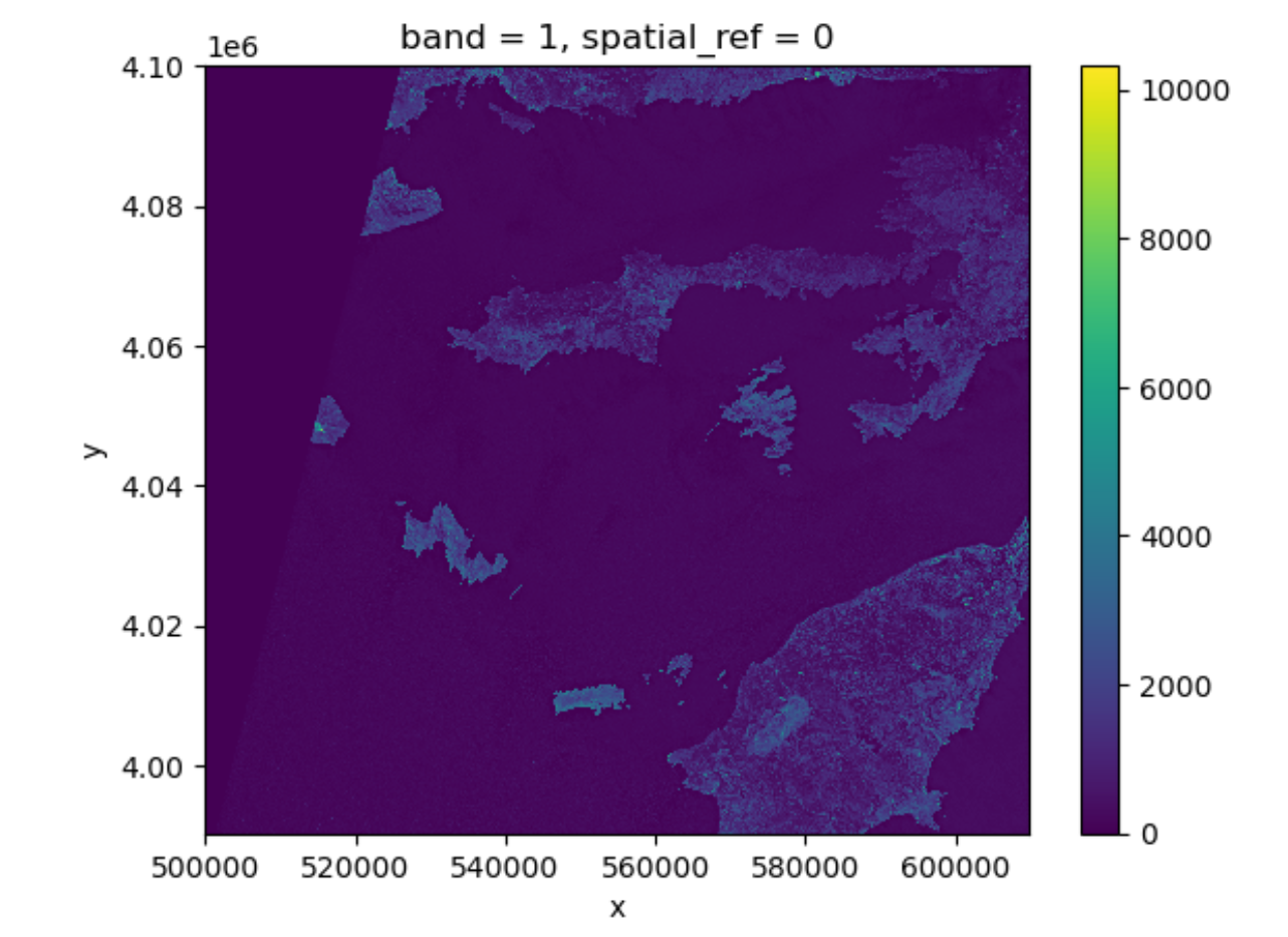
Notice that rioxarray helpfully allows us to plot this
raster with spatial coordinates on the x and y axis (this is not the
default in many cases with other functions or libraries). Nice plot!
However, it probably took a while for it to load therefore it would make
sense to resample it.
Resampling the raster image
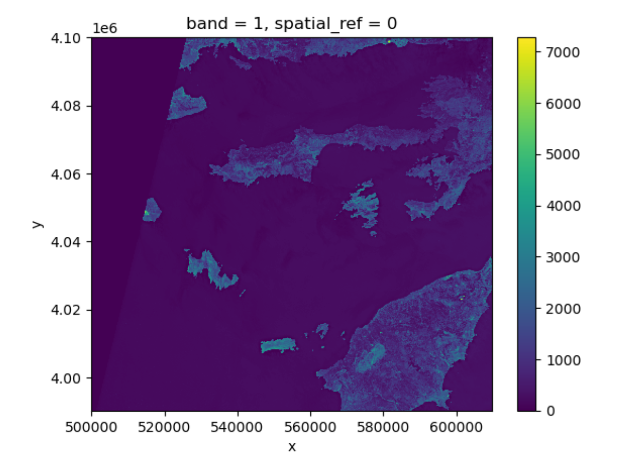
The red band image is available as a raster file with 10 m resolution, which makes it a relatively large file (few hundreds MBs). In order to keep calculations “manageable” (reasonable execution time and memory usage) we select here a lower resolution version of the image, taking advantage of the so-called “pyramidal” structure of cloud-optimized GeoTIFFs (COGs). COGs, in fact, typically include multiple lower-resolution versions of the original image, called “overviews”, in the same file. This allows us to avoid downloading high-resolution images when only quick previews are required.
Overviews are often computed using powers of 2 as down-sampling (or zoom) factors. So, typically, the first level overview (index 0) corresponds to a zoom factor of 2, the second level overview (index 1) corresponds to a zoom factor of 4, and so on. Here, we open the third level overview (index 2, zoom factor 8) and check that the resolution is about 80 m:
PYTHON
import rioxarray
rhodes_red_80 = rioxarray.open_rasterio("data/sentinel2/red.tif", overview_level=2)
print(rhodes_red_80.rio.resolution())
OUTPUT
(79.97086671522214, -79.97086671522214)Lets plot this one.
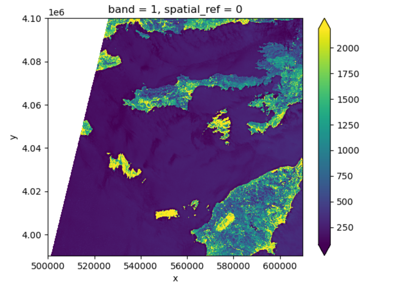
This plot shows the satellite measurement of the band
red for Rhodes before the wildfire. According to the Sentinel-2
documentaion, this is a band with the central wavelength of 665nm.
It has a spatial resolution of 10m. Note that the band=1 in
the image title refers to the ordering of all the bands in the
DataArray, not the Sentinel-2 band number 04
that we saw in the pystac search results.
Tool Tip
The option robust=True always forces displaying values
between the 2nd and 98th percentile. Of course, this will not work for
every case.
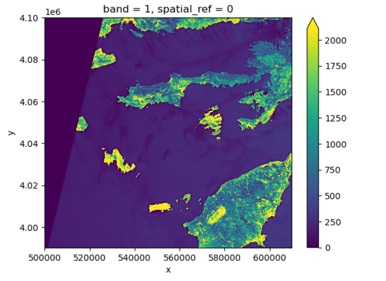
Now the color limit is set in a way fitting most of the values in the image. We have a better view of the ground pixels.
For a customized displaying range, you can also manually specifying
the keywords vmin and vmax. For example
ploting between 100 and 2000:
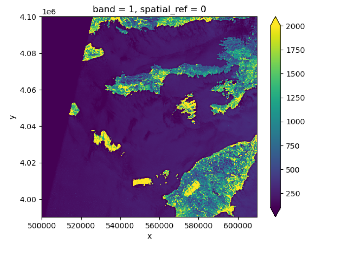
More options can be consulted here.
You will notice that these parameters are part of the
imshow method from the plot function. Since plot originates
from matplotlib and is so widely used, your python environment helps you
to interpret the parameters without having to specify the method. It is
a service to help you, but can be confusing when teaching it. We will
explain more about this below.
View Raster Coordinate Reference System (CRS) in Python
Another information that we’re interested in is the CRS, and it can
be accessed with .rio.crs. We introduced the concept of a
CRS in an earlier episode. Now we will see how
features of the CRS appear in our data file and what meanings they have.
We can view the CRS string associated with our DataArray’s
rio object using the crs attribute.
OUTPUT
EPSG:32635To print the EPSG code number as an int, we use the
.to_epsg() method (which originally is part of rasterio to_epsg):
OUTPUT
32635EPSG codes are great for succinctly representing a particular
coordinate reference system. But what if we want to see more details
about the CRS, like the units? For that, we can use pyproj
, a library for representing and working with coordinate reference
systems.
OUTPUT
<Projected CRS: EPSG:32635>
Name: WGS 84 / UTM zone 35N
Axis Info [cartesian]:
- E[east]: Easting (metre)
- N[north]: Northing (metre)
Area of Use:
- name: Between 24°E and 30°E, northern hemisphere between equator and 84°N, onshore and offshore. Belarus. Bulgaria. Central African Republic. Democratic Republic of the Congo (Zaire). Egypt. Estonia. Finland. Greece. Latvia. Lesotho. Libya. Lithuania. Moldova. Norway. Poland. Romania. Russian Federation. Sudan. Svalbard. Türkiye (Turkey). Uganda. Ukraine.
- bounds: (24.0, 0.0, 30.0, 84.0)
Coordinate Operation:
- name: UTM zone 35N
- method: Transverse Mercator
Datum: World Geodetic System 1984 ensemble
- Ellipsoid: WGS 84
- Prime Meridian: Greenwich
The CRS class from the pyproj library
allows us to create a CRS object with methods and
attributes for accessing specific information about a CRS, or the
detailed summary shown above.
A particularly useful attribute is area_of_use,
which shows the geographic bounds that the CRS is intended to be
used.
OUTPUT
AreaOfUse(west=24.0, south=0.0, east=30.0, north=84.0, name='Between 24°E and 30°E, northern hemisphere between equator and 84°N, onshore and offshore. Belarus. Bulgaria. Central African Republic. Democratic Republic of the Congo (Zaire). Egypt. Estonia. Finland. Greece. Latvia. Lesotho. Libya. Lithuania. Moldova. Norway. Poland. Romania. Russian Federation. Sudan. Svalbard. Türkiye (Turkey). Uganda. Ukraine.')Exercise: find the axes units of the CRS
What units are our data in? See if you can find a method to examine
this information using help(crs) or
dir(crs)
crs.axis_info tells us that the CRS for our raster has
two axis and both are in meters. We could also get this information from
the attribute rhodes_red_80.rio.crs.linear_units.
Understanding pyproj CRS Summary
Let’s break down the pieces of the pyproj CRS summary.
The string contains all of the individual CRS elements that Python or
another GIS might need, separated into distinct sections, and datum.
OUTPUT
<Projected CRS: EPSG:32635>
Name: WGS 84 / UTM zone 35N
Axis Info [cartesian]:
- E[east]: Easting (metre)
- N[north]: Northing (metre)
Area of Use:
- name: Between 24°E and 30°E, northern hemisphere between equator and 84°N, onshore and offshore. Belarus. Bulgaria. Central African Republic. Democratic Republic of the Congo (Zaire). Egypt. Estonia. Finland. Greece. Latvia. Lesotho. Libya. Lithuania. Moldova. Norway. Poland. Romania. Russian Federation. Sudan. Svalbard. Türkiye (Turkey). Uganda. Ukraine.
- bounds: (24.0, 0.0, 30.0, 84.0)
Coordinate Operation:
- name: UTM zone 35N
- method: Transverse Mercator
Datum: World Geodetic System 1984 ensemble
- Ellipsoid: WGS 84
- Prime Meridian: Greenwich- Name of the projection is UTM zone 35N (UTM has 60 zones, each 6-degrees of longitude in width). The underlying datum is WGS84.
- Axis Info: the CRS shows a Cartesian system with two axes, easting and northing, in meter units.
-
Area of Use: the projection is used for a
particular range of longitudes
24°E to 30°Ein the northern hemisphere (0.0°N to 84.0°N) - Coordinate Operation: the operation to project the coordinates (if it is projected) onto a cartesian (x, y) plane. Transverse Mercator is accurate for areas with longitudinal widths of a few degrees, hence the distinct UTM zones.
-
Datum: Details about the datum, or the reference
point for coordinates.
WGS 84andNAD 1983are common datums.NAD 1983is set to be replaced in 2022.
Note that the zone is unique to the UTM projection. Not all CRSs will have a zone. Below is a simplified view of US UTM zones.

Calculate Raster Statistics
It is useful to know the minimum or maximum values of a raster
dataset. We can compute these and other descriptive statistics with
min, max, mean, and
std.
PYTHON
print(rhodes_red_80.min())
print(rhodes_red_80.max())
print(rhodes_red_80.mean())
print(rhodes_red_80.std())
OUTPUT
<xarray.DataArray ()> Size: 2B
array(0, dtype=uint16)
Coordinates:
    spatial_ref  int32 4B 0
<xarray.DataArray ()> Size: 2B
array(7277, dtype=uint16)
Coordinates:
    spatial_ref  int32 4B 0
<xarray.DataArray ()> Size: 8B
array(404.07532588)
Coordinates:
    spatial_ref  int32 4B 0
<xarray.DataArray ()> Size: 8B
array(527.5557502)
Coordinates:
    spatial_ref  int32 4B 0
The information above includes a report of the min, max, mean, and
standard deviation values, along with the data type. If we want to see
specific quantiles, we can use xarray’s .quantile() method.
For example for the 25% and 75% quantiles:
OUTPUT
<xarray.DataArray (quantile: 2)> Size: 16B
array([165., 315.])
Coordinates:
* quantile (quantile) float64 16B 0.25 0.75Data Tip - NumPy methods
You could also get each of these values one by one using
numpy.
PYTHON
import numpy
print(numpy.percentile(rhodes_red_80, 25))
print(numpy.percentile(rhodes_red_80, 75))
OUTPUT
165.0
315.0
You may notice that rhodes_red_80.quantile and
numpy.percentile didn’t require an argument specifying the
axis or dimension along which to compute the quantile. This is because
axis=None is the default for most numpy functions, and
therefore dim=None is the default for most xarray methods.
It’s always good to check out the docs on a function to see what the
default arguments are, particularly when working with multi-dimensional
image data. To do so, we can
usehelp(rhodes_red_80.quantile) or
?rhodes_red_80.percentile if you are using jupyter notebook
or jupyter lab.
Dealing with Missing Data
So far, we have visualized a band of a Sentinel-2 scene and
calculated its statistics. However, as you can see on the image it also
contains an artificial band to the top left where data is missing. In
order to calculate meaningfull statistics, we need to take missing data
into account. Raster data often has a “no data value” associated with it
and for raster datasets read in by rioxarray. This value is
referred to as nodata. This is a value assigned to pixels
where data is missing or no data were collected. There can be different
cases that cause missing data, and it’s common for other values in a
raster to represent different cases. The most common example is missing
data at the edges of rasters.
By default the shape of a raster is always rectangular. So if we have a dataset that has a shape that isn’t rectangular, like most satellite images, some pixels at the edge of the raster will have no data values. This often happens when the data were collected by a sensor which only flew over some part of a defined region and is also almost by default because of the fact that the earth is not flat and that we work with geographic and projected coordinate system.
To check the value of nodata
of this dataset you can use:
OUTPUT
0You will find out that this is 0. When we have plotted the band data, or calculated statistics, the missing value was not distinguished from other values. Missing data may cause some unexpected results.
To distinguish missing data from real data, one possible way is to
use nan(which stands for Not a Number) to represent them.
This can be done by specifying masked=True when loading the
raster. Let us reload our data and put it into a different variable with
the mask:
PYTHON
rhodes_red_mask_80 = rioxarray.open_rasterio("data/sentinel2/red.tif", masked=True, overview_level=2)Let us have a look at the data.
One can also use the where function, which is standard
python functionality, to select all the pixels which are different from
the nodata value of the raster:
Either way will change the nodata value from 0 to
nan. Now if we compute the statistics again, the missing
data will not be considered. Let´s compare them:
PYTHON
print(rhodes_red_80.min())
print(rhodes_red_mask_80.min())
print(rhodes_red_80.max())
print(rhodes_red_mask_80.max())
print(rhodes_red_80.mean())
print(rhodes_red_mask_80.mean())
print(rhodes_red_80.std())
print(rhodes_red_mask_80.std())
OUTPUT
<xarray.DataArray ()> Size: 2B
array(0, dtype=uint16)
Coordinates:
spatial_ref int32 4B 0
<xarray.DataArray ()> Size: 4B
array(1., dtype=float32)
Coordinates:
spatial_ref int32 4B 0
<xarray.DataArray ()> Size: 2B
array(7277, dtype=uint16)
Coordinates:
spatial_ref int32 4B 0
<xarray.DataArray ()> Size: 4B
array(7277., dtype=float32)
Coordinates:
spatial_ref int32 4B 0
<xarray.DataArray ()> Size: 8B
array(404.07532588)
Coordinates:
spatial_ref int32 4B 0
<xarray.DataArray ()> Size: 4B
array(461.78833, dtype=float32)
Coordinates:
spatial_ref int32 4B 0
<xarray.DataArray ()> Size: 8B
array(527.5557502)
Coordinates:
spatial_ref int32 4B 0
<xarray.DataArray ()> Size: 4B
array(539.82855, dtype=float32)
Coordinates:
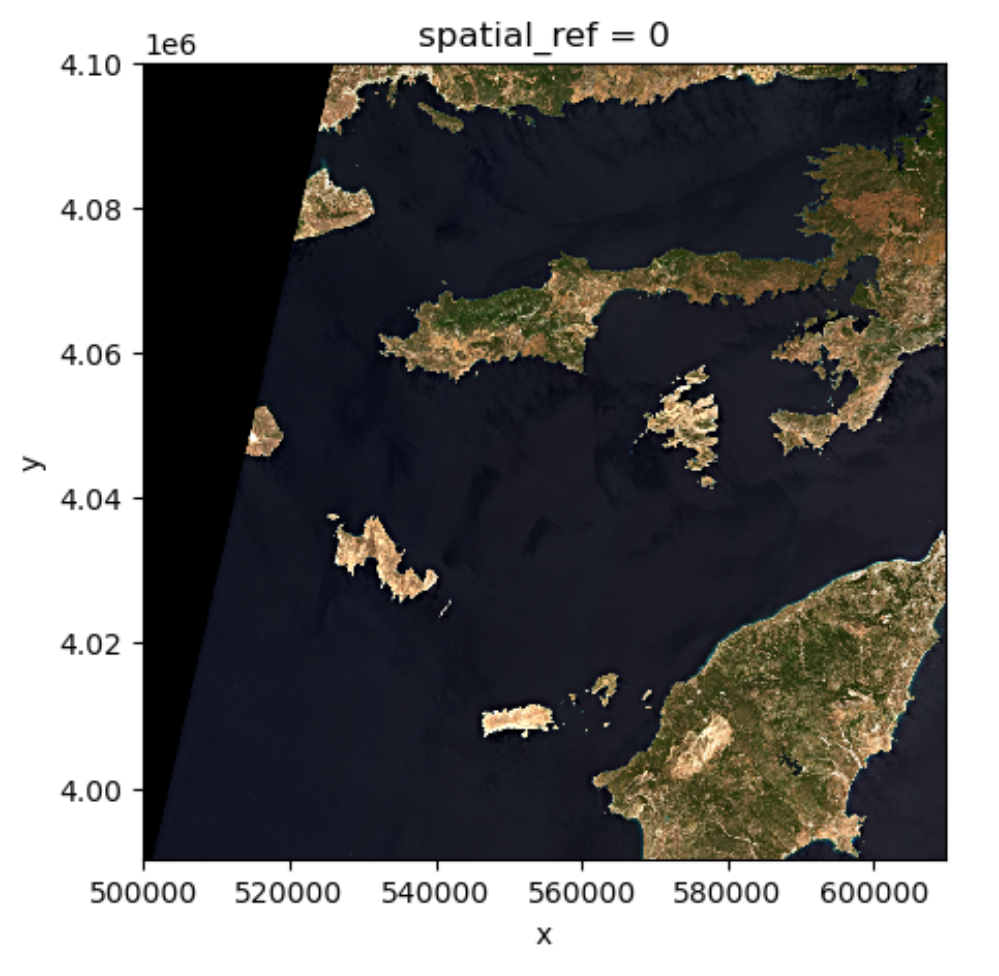
spatial_ref int32 4B 0And if we plot the image, the nodata pixels are not
shown because they are not 0 anymore:
One should notice that there is a side effect of using
nan instead of 0 to represent the missing
data: the data type of the DataArray was changed from
integers to float (as can be seen when we printed the statistics). This
needs to be taken into consideration when the data type matters in your
application.
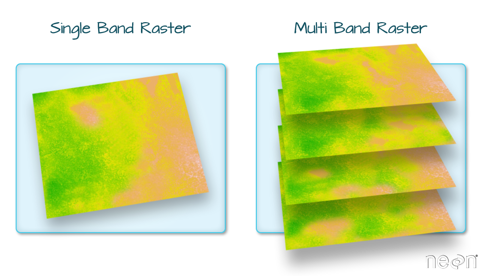
Raster Bands
So far we looked into a single band raster, i.e. the red
band of a Sentinel-2 scene. However, for certain applications it is
helpful to visualize the true-color image of the region. This is
provided as a multi-band raster – a raster dataset that contains more
than one band.
The visual asset in the Sentinel-2 scene is a multiband
asset. Similar to the red band, we can load it by:
PYTHON
rhodes_visual = rioxarray.open_rasterio('data/sentinel2/visual.tif', overview_level=2)
rhodes_visual
OUTPUT
<xarray.DataArray (band: 3, y: 1373, x: 1373)> Size: 6MB
[5655387 values with dtype=uint8]
Coordinates:
  * band         (band) int32 12B 1 2 3
  * x            (x) float64 11kB 5e+05 5.001e+05 ... 6.097e+05 6.097e+05
  * y            (y) float64 11kB 4.1e+06 4.1e+06 4.1e+06 ... 3.99e+06 3.99e+06
    spatial_ref  int32 4B 0
Attributes:
    AREA_OR_POINT:       Area
    OVR_RESAMPLING_ALG:  AVERAGE
    _FillValue:          0
    scale_factor:        1.0
    add_offset:          0.0
The band number comes first when GeoTiffs are read with the
.open_rasterio() function. As we can see in the
xarray.DataArray object, the shape is now
(band: 3, y: 1373, x: 1373), with three bands in the
band dimension. It’s always a good idea to examine the
shape of the raster array you are working with and make sure it’s what
you expect. Many functions, especially the ones that plot images, expect
a raster array to have a particular shape. One can also check the shape
using the .shape
attribute:
OUTPUT
(3, 1373, 1373)One can visualize the multi-band data with the
DataArray.plot.imshow() function:
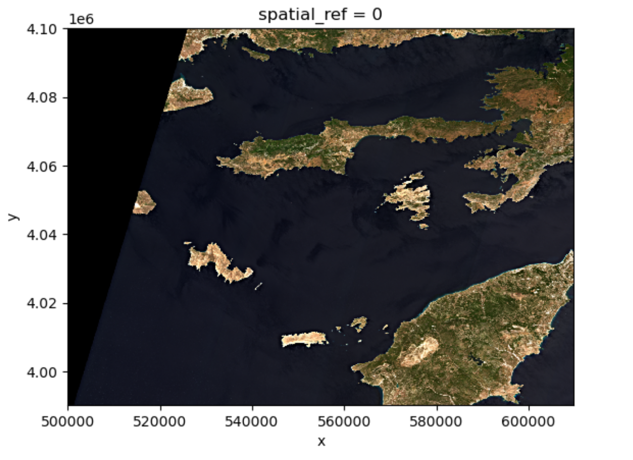
Note that the DataArray.plot.imshow() function makes
assumptions about the shape of the input DataArray, that since it has
three channels, the correct colormap for these channels is RGB. It does
not work directly on image arrays with more than 3 channels. One can
replace one of the RGB channels with another band, to make a false-color
image.
Exercise: set the plotting aspect ratio
As seen in the figure above, the true-color image is stretched. Let’s
visualize it with the right aspect ratio. You can use the documentation
of DataArray.plot.imshow().
Since we know the height/width ratio is 1:1 (check the
rio.height and rio.width attributes), we can
set the aspect ratio to be 1. For example, we can choose the size to be
5 inches, and set aspect=1. Note that according to the documentation
of DataArray.plot.imshow(), when specifying the
aspect argument, size also needs to be
provided.
-
rioxarrayandxarrayare for working with multidimensional arrays like pandas is for working with tabular data. -
rioxarraystores CRS information as a CRS object that can be converted to an EPSG code or PROJ4 string. - Missing raster data are filled with nodata values, which should be handled with care for statistics and visualization.